 I enjoy doing things like this
Tuesday 1 June 2010
Bookbinding


 Book making is such a fine craft and I love how hands on it is. I find when I am doing my main projects on the curse I tend not to use my hands as much, I guess I feel I have to be more computer based, and with these workshops I feel as though it is play time. We spend the majority of the sessions cutting, measuring, gluing, and sometimes stitching, often frustratingly, yet I find it all quite exciting and also relaxing. There is always that point where you don’t know how it is going to turn out, if it will fit right, but this is all part of the fun. Here is a selection of the books I have made over in the past few weeks. Although simple, a lot of work goes into them all. Also my project for this brief I had to produce 10 beak books and come up with on going concept. After many experiments, I based my books on ‘Bird goes on holiday’. I really enjoyed making these and doing my own illustration was enjoyable, and in my presentation, it was lovely to see people smiling and laughing at my little bird adventures.
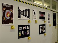
Installed magazine spreads

 For this brief I had to choose a world form a list which was installed and researched into it, then using the research that I found I had to interpret a series of responses on 4 double-page spreads in a order. Spread 1 explore the use of your chosen word. Spread 2 use 10 words that explain/relate to the meaning of your chosen word. Spread 3 use 50 words that explain/relate to the meaning of your chosen word. Spread 4 use 500 words that explain/relate to the meaning of your chosen word. I also had to Put together a short set of Guidelines, Style Sheets from which your spreads have been structured. My format was tight it had to be h 297mm x w 235mm, so just a bit bigger than A4. The typeface guidelines were 3 variants of Helvetica, Helvetica Bold & Helvetica Italic. The colour was also a restricted palette. I had to work with 2 colours and stock. I worked on washing machines and these then became my layouts. I enjoyed this brief because we had never done anything like this before and with us having John Walsh as a tutor it was good to see how he worked and what he liked and didn’t.
Book Covers


 I was asked to design a series of covers or a title sequence for at least 4 books from a selection of book sets. Set 1 – Alan Warner, Set 2 – ‘Futureshock’, Set 3 – Puffin Classics and Set 4 – Rough Guides. I was asked to consider how my designs could be utilised as a packaging solution for a box-set. I needed to provide the following information that consisted of the format of the book, the size, function and a blurb. My books also had to have the same size cover, front design, back and spine. I had to remember to define my audience for the books and my choice of publisher would be important as my book designs would have to reflect the typical output of the company. First I chose set 2, the ‘Futureshock’ books, this set of books was unfamiliar to me and the titles made me want to know more about them. The publisher that I chose was penguin modern classics. I chose this because I wanted my format to be photography and style to be clean and fresh, and I felt that this collection would fit best for my designs.
Friday 19 March 2010
One Dot Zero


 I have designed a cover for my animation, a concertina book of my drawings from the animation and also a t-shirt. With the brief telling us to not limit myself to making a finished film, and also knowing that One Dot Zero are about experimentation with moving image in any context, so I thought that a concertina book and a t-shirt is something that we can move ourselves.
One Dot Zero

The brief was asking me to explore the concept of ‘The Disappearing City’ via a progressive, multi-disciplinary, cross-media approach to storytelling, with a work of moving image at the heart of your final piece. I was not-to-not limit myself into making a finished film but I felt it was relevant. onedotzero is about experimentation with moving image in any context, so as well as film and animation, experimental work in motion graphics, installations and even live action would be relevant.
My final book for group project


Monday 15 February 2010
The Trains Standing at Platform 2


Final outcomes


Work from summer 09


Monday 1 February 2010
Stonewall Campaign

We were asked to produce an eye-catching persuasive awareness campaign to encourage people to register and use their vote for the company Stonewall. We had to Remember that as a registered charity Stonewall was politically neutral. They work with all the political parties so our creative thinking must not of been biased towards one party in particular. Our Design ideas had to adaptable so that they could be utilised across a number of marketing formats to include posters, leaflets/postcards, billboards and TV. Our groups messages was that that you have no right to complain about the government if you do not vote. First we each design a postcard for the stonewall competition, then from the postcard we expanded all of our work and produced numerous peaces of work that would adapt to the brief. We wanted the British people to enjoy voting and get excited about it like the Americans do and with there global campaigns. Our main peace of work was a stop frame animation video, this consisted of all the materials used in the postcards and more. We made the movie fun to watch and to have a story behind it so that our audience would engage well to the movie and remember it. Stop frame was very time consuming, but over all very pleased and also proud of our movie for being fun, and also our other products that we made to go towards the brief.
Photography workshop, Final
Photography workshop, Diana camera

 I went off the idea of the homage to my grand parents, and wanted to start something fresh.
I still wanted to keep the layering and collage but involving something new and different. I have been using my Diana camera to take all of these photos, and decided to turn around and take images of my vetro camera and see what the outcome would be.


